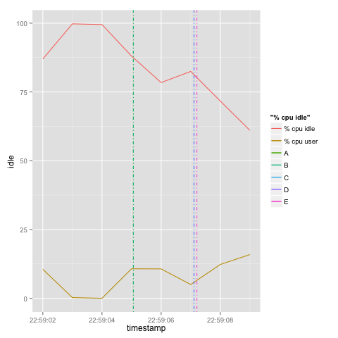
Friday, April 5, 2013

Vertical line markers in R using geom_vline

Say you have a two data sets that share a common dimension/axis only.  Here's an example:

# Event csv
timestamp,event
2013-04-03 22:59:05.061Z,A
2013-04-03 22:59:05.061Z,B
2013-04-03 22:59:07.109Z,C
2013-04-03 22:59:07.115Z,D
2013-04-03 22:59:07.209Z,E

# Performance data
hostname;interval;timestamp;CPU;user;nice;system;iowait;steal;idle
box1;1;2013-04-03 22:59:02 UTC;-1;10.53;0.00;2.01;0.50;0.00;86.97
box1;1;2013-04-03 22:59:03 UTC;-1;0.25;0.00;0.00;0.00;0.00;99.75
box1;1;2013-04-03 22:59:04 UTC;-1;0.00;0.00;0.25;0.25;0.00;99.50
box1;1;2013-04-03 22:59:05 UTC;-1;10.72;0.00;1.00;0.25;0.00;88.03
box1;1;2013-04-03 22:59:06 UTC;-1;10.67;0.00;10.67;0.00;0.25;78.41
box1;1;2013-04-03 22:59:07 UTC;-1;5.01;0.00;9.02;3.51;0.00;82.46
box1;1;2013-04-03 22:59:08 UTC;-1;12.28;0.00;11.53;4.26;0.25;71.68
box1;1;2013-04-03 22:59:09 UTC;-1;15.88;0.00;11.66;10.92;0.50;61.04
You'd like to plot these values on one graph; one overlaid over the other. Based on the data from the example above, you'd like to plot the CPU user against the timestamp metric, then you'd like to add in markers to show events over the chart.

Here's a gist:
events <- read.csv("events.csv")
> head(events)
timestamp event
1 2013-04-03 22:59:05.061Z A
2 2013-04-03 22:59:05.061Z B
3 2013-04-03 22:59:07.109Z C
4 2013-04-03 22:59:07.115Z D
5 2013-04-03 22:59:07.209Z E
performance <- read.csv("performance.csv", header=TRUE,sep=";")
> head(performance)
hostname interval timestamp CPU user nice system iowait steal idle
1 box1 1 2013-04-03 22:59:02 UTC -1 10.53 0 2.01 0.50 0.00 86.97
2 box1 1 2013-04-03 22:59:03 UTC -1 0.25 0 0.00 0.00 0.00 99.75
3 box1 1 2013-04-03 22:59:04 UTC -1 0.00 0 0.25 0.25 0.00 99.50
4 box1 1 2013-04-03 22:59:05 UTC -1 10.72 0 1.00 0.25 0.00 88.03
5 box1 1 2013-04-03 22:59:06 UTC -1 10.67 0 10.67 0.00 0.25 78.41
6 box1 1 2013-04-03 22:59:07 UTC -1 5.01 0 9.02 3.51 0.00 82.46
performance$timestamp <- as.POSIXlt(perfomance$timestamp)
events$timestamp <- as.POSIXlt(events$timestamp)
> str(performance)
'data.frame': 8 obs. of 10 variables:
$ hostname : Factor w/ 1 level "box1": 1 1 1 1 1 1 1 1
$ interval : int 1 1 1 1 1 1 1 1
$ timestamp: Factor w/ 8 levels "2013-04-03 22:59:02 UTC",..: 1 2 3 4 5 6 7 8
$ CPU : int -1 -1 -1 -1 -1 -1 -1 -1
$ user : num 10.53 0.25 0 10.72 10.67 ...
$ nice : num 0 0 0 0 0 0 0 0
$ system : num 2.01 0 0.25 1 10.67 ...
$ iowait : num 0.5 0 0.25 0.25 0 ...
$ steal : num 0 0 0 0 0.25 0 0.25 0.5
$ idle : num 87 99.8 99.5 88 78.4 ...
# Plot the first dataset. Two line plots sharing the same X axis.
p <- ggplot(data=performance, aes(x=timestamp)) + geom_line(aes(y=idle, colour="% cpu idle")) + geom_line(aes(y=user, colour="% cpu user")) + scale_x_datetime(labels = date_format("%H:%M:%S"))
# Plot the vertical lines
p + geom_vline(data=events, linetype=4, aes(colour=factor(event),xintercept=as.numeric(timestamp)) )


 Obviously, we need a better legend, y axis label and a title for this graph.. That's left as an exercise.

Tuesday, April 2, 2013

R and GFS.

Playing with NOAA's GFS data with R.

Credit:

Here are some sample images.


Pre-requisites

  • Fetched data from NOAA (in particular this dataset).
  • Installed wgrib2.
  • Extracted the fields I was interested in from the grib2 file into netcdf
./grib2/wgrib2/wgrib2  -s  gfs.t12z.sfluxgrbf03.grib2  | grep :LAND | ./grib2/wgrib2/wgrib2 -i gfs.t12z.sfluxgrbf03.grib2 -netcdf land.netcdf
./grib2/wgrib2/wgrib2  -s  gfs.t12z.sfluxgrbf03.grib2  | grep TMP:2 | ./grib2/wgrib2/wgrib2 -i gfs.t12z.sfluxgrbf03.grib2 -netcdf temp2.netcdf
./grib2/wgrib2/wgrib2  -s  gfs.t12z.sfluxgrbf03.grib2  | grep VEG: | ./grib2/wgrib2/wgrib2 -i gfs.t12z.sfluxgrbf03.grib2 -netcdf vegetation.netcdf
./grib2/wgrib2/wgrib2  -s  gfs.t12z.sfluxgrbf03.grib2  | grep TCDC: | ./grib2/wgrib2/wgrib2 -i gfs.t12z.sfluxgrbf03.grib2 -netcdf cloud.netcdf

  • You can also view the available fields using:
./grib2/wgrib2/wgrib2  -s  gfs.t12z.sfluxgrbf03.grib2  | less

Having fun

Started R and installed netcdf and fields:
install.packages('ncdf')
install.packages('fields')
Then used the following gist in R.
# load datasets
library(fields)
library(ncdf)
# Load land data
landFrac <-open.ncdf("land.netcdf")
land <- get.var.ncdf(landFrac,"LAND_surface")
x <- get.var.ncdf(landFrac,"longitude")
y <- get.var.ncdf(landFrac,"latitude")
# Load temp data
tempFrac <-open.ncdf("temp2.netcdf")
# Temperature 2 metres above ground
temp_k <- get.var.ncdf(tempFrac, "TMP_2maboveground")
temp_c <- temp_k - 273.15 # Kelvins to Centigrade
# Palette for temp data
rgb.palette.temp <- colorRampPalette(c("snow1","snow2","snow3","seagreen","orange","firebrick"), space = "rgb")
# View temp plot
image.plot(x,y,temp_c,col=rgb.palette.temp(200),axes=F,main=as.expression(paste("GFS 24hr Average 2M Temperature ",format(Sys.time(), "%Y-%m-%d") ," 03 UTC",sep="")), legend.lab="o C")
# save plot to file
png("/tmp/temp.png", 1600, 800)
image.plot(x,y,temp_c,col=rgb.palette.temp(200),axes=F,main=as.expression(paste("GFS 24hr Average 2M Temperature ",format(Sys.time(), "%Y-%m-%d") ," 03 UTC",sep="")), legend.lab="o C")
dev.off()
# Vegetation
vegFrac <-open.ncdf("vegetation.netcdf")
vegetation <- get.var.ncdf(vegFrac, "VEG_surface")
# Truncate unrealistic values
vegetation[vegetation > 100000] <- 0
# Palette
rgb.palette.veg <- colorRampPalette(c("seashell","firebrick","orange","seagreen"), space = "rgb")
# Plot
image.plot(x,y,vegetation,col=rgb.palette.veg(100),axes=F,main=as.expression(paste("Percentage of land under vegetation cover",format(Sys.time(), "%Y-%m-%d") ," 03 UTC",sep="")), legend.lab="coverage %")
# Or save png
png("/tmp/vegetation.png", 1600, 800)
image.plot(x,y,vegetation,col=rgb.palette.veg(100),axes=F,main=as.expression(paste("Percentage of land under vegetation cover",format(Sys.time(), "%Y-%m-%d") ," 03 UTC",sep="")), legend.lab="coverage %")
dev.off()
# Cloudiness
cloudFrac <-open.ncdf("cloud.netcdf")
lowclouds <- get.var.ncdf(cloudFrac, "TCDC_lowcloudlayer")
rgb.palette.clouds <- colorRampPalette(c("royalblue1", "lightskyblue", "lightsteelblue1", "papayawhip","snow"), space = "rgb")
# Preview
image.plot(x,y, lowclouds, col=rgb.palette.veg(100),axes=F,main=as.expression(paste("Percentage of total cloud cover (low clouds) ",format(Sys.time(), "%Y-%m-%d") ," 03 UTC",sep="")), legend.lab="coverage %")
image.plot(x,y, lowclouds, col=rgb.palette.clouds(100),axes=F,main=as.expression(paste("Percentage of total cloud cover (low clouds) ",format(Sys.time(), "%Y-%m-%d") ," 03 UTC",sep="")), legend.lab="coverage %")
contour(x,y,land,add=TRUE,lwd=1,levels=0.99,drawlabels=FALSE,col="grey30") #add land outlineland2 <- get.var.ncdf(landFrac2, "LAND_surface")
# Save png
png("/tmp/lowclouds.png", 1600, 800)
image.plot(x,y, lowclouds, col=rgb.palette.clouds(100),axes=F,main=as.expression(paste("Percentage of total cloud cover (low clouds) ",format(Sys.time(), "%Y-%m-%d") ," 03 UTC",sep="")), legend.lab="coverage %")
contour(x,y,land,add=TRUE,lwd=1,levels=0.99,drawlabels=FALSE,col="grey30") #add land outlineland2 <- get.var.ncdf(landFrac2, "LAND_surface")
dev.off()
view raw noaa_gfs.R hosted with ❤ by GitHub